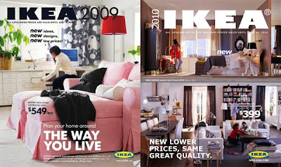
Yes your eyes don't deceive you. It is Verdana! I know what you’re thinking... Isn't that a web font? Yes of course it is. IKEA have changed their font from a custom Futura to Verdana for 2010!
Verdana was invented by Microsoft, and was intended to be used on a screen. It has open, wide letterforms with lots of space between characters to aid legibility at small sizes on screen. The font is a simplified "dumb-down" typeface.
To say the least when this font isn't used for screen it is ugly! Very ugly. Especially when enlarged. It is clumsy and lacks sophistication!
So why have they used such a typeface?
"It's more efficient and cost-effective," says IKEA spokeswoman Monika Gocic. "Plus, it's a simple, modern-looking typeface." Freely distributed by Microsoft, the typeface allows IKEA to use the same font in all countries and with many alphabets.
Basically they have sacrificed style and gone cheap! The very thing that catapulted IKEA's success (elegance and style at an affordable cost, bringing beauty to the masses) they have thrown away and lost a major part of their brand and identity.
Well lets all hope the big-wigs up in IKEA Towers have a good long re-think about what font they decide to use!
Keep Creative,
James


